
The Charlotte Hornets (currently the Bobcats) are set to return to the NBA next season. Last month the team announced the team would return to teal and purple as their main colours, tonight Chairman Michael Jordan introduced the team’s logos and wordmark during halftime of the Bobcats/Jazz game. The unveiling also featured Hornets legends Muggsy Bogues, Rex Chapman, Dell Curry and Kelly Tripucka.
![]()
As per the team release.
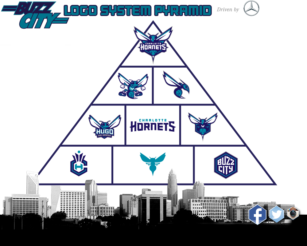
- The primary logo utilizes the purple and teal colour palette and features an aggressive-looking hornet that is ready to attack. Its piercing eyes, raised antennae, expanded wings and pointed stinger depict its relentless intensity. Incorporated within the logo is a basketball that doubles as the hornet’s body. The Charlotte Hornets wordmark is written across the insect. The logo contains several odes to that of the original Hornets with its white wings, white accents within its eyes, a stinger and the inclusion of a basketball.
- The logo represents several characteristics of actual hornets, including their swarming and attacking nature, along with their fierceness and relentlessness when protecting their nests. These same characteristics connect with the city of Charlotte itself. The city’s rebelliousness, aggressiveness and protective attributes date to the Revolutionary War when British commander General Cornwallis referred to Charlotte as “a hornet’s nest of rebellion.”
 The organization also announced that the beloved “Hugo” will officially return to Buzz City as the team’s mascot. The Hornets brand identity includes a modernized version of the original “Hugo” logo that will be utilized for the mascot and its brand. This logo is designed and intended for use as it relates to Hugo, and supplies the organization with a separate identity for one of the NBA’s most famous mascots. The refreshed Hugo logo contains several similarities to the original, with Hugo wearing white gloves and basketball shoes, possessing that trademark smile and having the letter “H” on his chest. Rather than bouncing a basketball, the updated logo continues the theme of the basketball as part of the hornet’s body.
- The secondary logo features a side view of the hornet in an attacking
Hornets lposition with elongated wings, aggressive eyes and extended stinger. The body once again consists of a basketball, while the curled body shape represents the letter “C” for the city of Charlotte. It also consists of the purple and teal colors like the primary logo. - The Hornets wordmark includes the word Charlotte in teal written above the purple Hornets name.
The entire brand identity was designed in collaboration with senior executives within the Bobcats organization; Jordan Brand; and the NBA’s Global Merchandising Group.
My thoughts: I love it! When it was announced the Hornets name would return to Charlotte, I was envisioning their new identity, will they be going back to the old logo but with subtle changes, or will they go completely redesigned. Envision no longer, the primary logo is new and it looks amazing, it really does invoke fierceness. The old logo is paid homage to, it will be the logo for their mascot Hugo (who makes a return as well). The secondary logo is perfect. The Crown CH logo is smart, I like how they shaped the ‘C’ into a honeycomb. If I had to nitpick, I feel they could’ve done better with the wordmark, but’s it ok, it’s not bad. Overall, the new logo ranks in my books as one of the best in the league, I can’t wait to see what the uniforms will look like, teal and purple is just unique, it is Charlotte.
